This is a subtitle for your new post
Welcome to XL Intelligence, your go-to source for mastering Excel data visualisation and infographics. In today's data-driven world, the ability to effectively convey information is paramount, and Excel offers a treasure trove of tools for achieving just that. In this article, we will delve deep into the world of Excel data visualisation and infographics, unlocking the potential for insightful and engaging data presentation.
Leveraging Excel for Data Visualisation
At XL Intelligence, we recognise Excel's incredible potential when it comes to handling data. Excel, a familiar software for many, offers a robust platform for managing and analysing data efficiently. Its versatility, combined with its user-friendly interface, makes it an ideal choice for businesses seeking to make sense of their data.
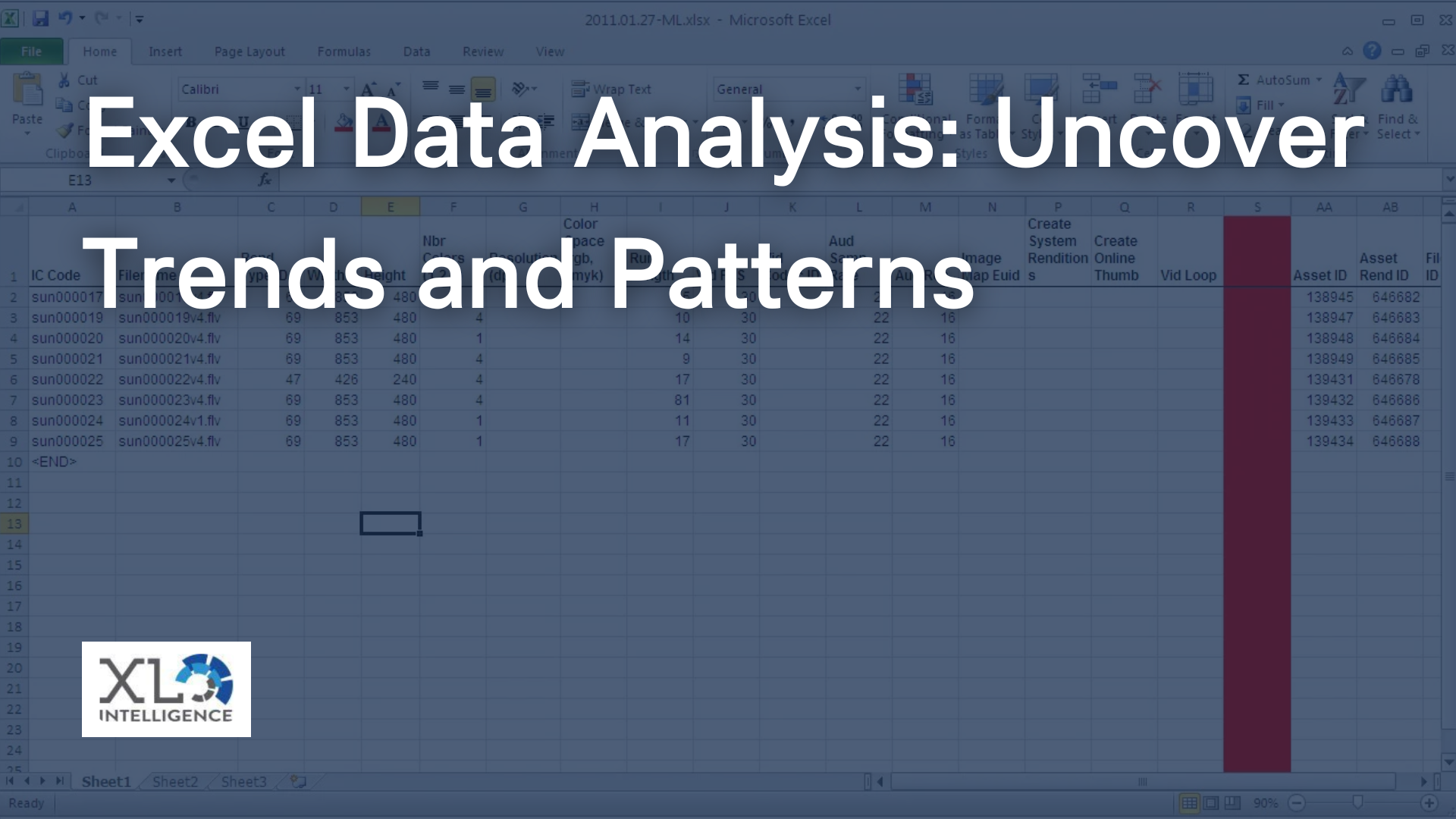
Data visualisation plays a pivotal role in simplifying complex information. Excel's built-in charting and graphing capabilities are a testament to its prowess in this domain. With Excel, you can effortlessly transform rows of raw data into visually compelling representations, allowing for better decision-making and communication within your organisation.
- Key points to cover:
- The importance of data visualisation in decision-making.
- How Excel simplifies data processing.
- Benefits of using Excel for data visualisation.
Excel Infographics: A Game-Changer for Data Presentation
What are Excel Infographics?
Excel infographics are a dynamic way to present data, combining the power of charts, graphs, and images to convey complex information at a glance. They are not just static charts but interactive visual representations that can tell a story, making data more engaging and memorable.
Advantages of Using Excel for Creating Infographics
At XL Intelligence, we've seen firsthand the advantages of using Excel for creating infographics. Some of the notable benefits include:
- Versatility: Excel provides a wide range of chart types and customisation options, enabling you to tailor your infographics to your specific needs.
- Data Integration: Excel seamlessly integrates with other Microsoft Office applications, making it easy to embed your infographics into reports, presentations, or documents.
- Accessibility: Most businesses already have Excel installed, so there's no need for additional software or training to start creating infographics.
- Interactivity: Excel infographics can include interactive elements like drop-down lists and buttons, allowing users to explore data on their own.
Let me share a personal anecdote to illustrate the point. As a data analyst at XL Intelligence, I once faced the challenge of presenting a complex dataset to a non-technical audience. By using Excel infographics, I was able to create an interactive dashboard that allowed stakeholders to explore the data, gaining valuable insights without being overwhelmed by numbers and tables.
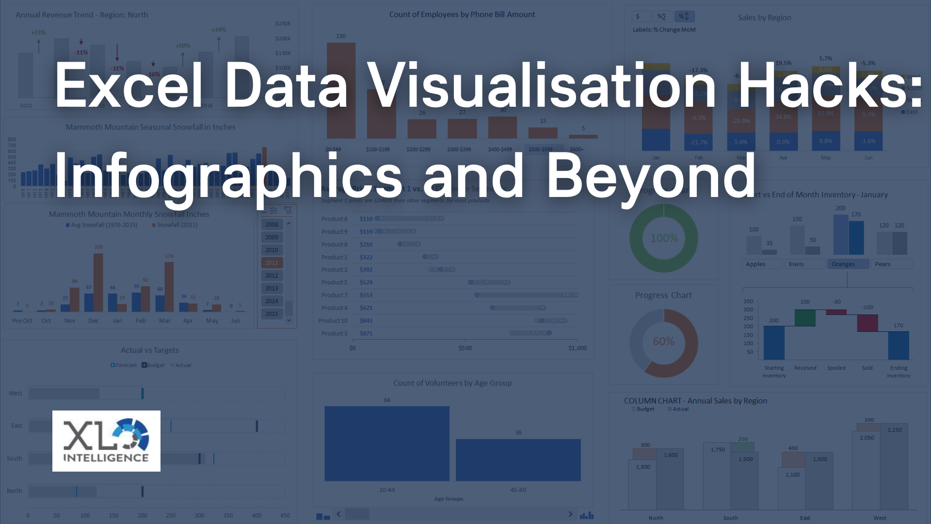
Excel Data Visualisation Hacks
Tips and Tricks for Enhancing Data Visualisation in Excel
Unlocking the full potential of Excel for data visualisation requires some insider knowledge. Here are some tips and tricks to help you excel in Excel:
- Choose the Right Chart Type: Excel offers a variety of chart types, each suited for different data types. Select the one that best represents your data, whether it's a pie chart, bar graph, or scatter plot.
- Customise Excel Visuals: Tailor your charts and graphs to convey the intended message effectively. Adjust colours, labels, and fonts to match your branding or enhance readability.
- Incorporate Interactivity: Excel's features allow you to create interactive dashboards with dropdown menus and slicers, providing users with an engaging and customised experience.
How XL Intelligence Specialises in Optimising Excel for Data Visualisation
At XL Intelligence, we take data visualisation to the next level. Our team of experts is dedicated to helping businesses harness the full potential of Excel. We provide custom solutions, including Excel templates and add-ins, designed to streamline the data visualisation process. Our expertise ensures that your data is not just visualised but presented in a way that resonates with your audience.
Beyond the Basics: Advanced Data Visualisation Techniques
Expanding Excel's Capabilities with Add-ins and Plugins
While Excel is a robust tool on its own, it can be supercharged with the right add-ins and plugins. These extensions enhance its data visualisation capabilities, enabling you to create stunning infographics effortlessly.
- Power BI: Microsoft's Power BI is a game-changer for Excel users, offering advanced data visualisation features and seamless integration with Excel.
- Tableau Integration: Combining Tableau with Excel opens up new possibilities for dynamic data dashboards and in-depth analytics.
Showcasing XL Intelligence's Innovative Tools for Excel Data Visualisation
XL Intelligence understands that staying ahead in data visualisation requires innovation. Our proprietary tools and templates are designed to elevate your Excel data visualisation game. Whether it's dynamic infographics or automated reporting, we have the solutions to make your data shine.
Case Studies Illustrating the Impact of Advanced Excel Data Visualisation
Let's delve into some real-world examples to see how advanced Excel data visualisation techniques can make a difference:
- Retail Analytics: We helped a retail giant transform their sales data into interactive Excel dashboards. This allowed them to track sales trends, optimise inventory, and make data-driven decisions, resulting in a significant boost in revenue.
- Financial Reporting: For a financial institution, we developed automated Excel reports with interactive charts. This reduced manual effort, improved accuracy, and enabled quicker decision-making.
Infographics vs. Traditional Reports: Why Excel Infographics Shine
A Comparison Between Infographics and Traditional Data Reports
Traditional data reports often present a dense wall of numbers and text, leaving room for misinterpretation and disengagement. Excel infographics, on the other hand, transform data into visual stories that are easier to grasp and remember.
How Excel Infographics Elevate Data Communication
Excel infographics have the power to engage your audience, making complex data more accessible. Whether you're presenting to clients, colleagues, or stakeholders, infographics facilitate better understanding and decision-making.
At XL Intelligence, we've witnessed the transformation that occurs when businesses switch from traditional reports to Excel infographics. The impact is not just in the aesthetics but in the clarity and effectiveness of communication.
Best Practices for Creating Excel Infographics
Creating Excel infographics requires a systematic approach. Follow these best practices to ensure your infographics are not just visually appealing but also informative:
- Define Your Objectives: Start by clarifying your goals. What message do you want to convey through your infographic?
- Organise Your Data: Clean and structure your data before importing it into Excel. Well-organised data makes the visualisation process smoother.
- Choose the Right Visuals: Select the appropriate chart types and visuals that best represent your data.
- Tell a Story: Arrange your data and visuals in a logical flow that tells a narrative.
- Keep it Simple: Avoid clutter and excessive decoration. Simplicity enhances comprehension.
- Test for Interactivity: If applicable, ensure that any interactive elements work seamlessly.
- Seek Feedback: Don't hesitate to get input from colleagues or stakeholders to refine your infographics.
Conclusion
In conclusion, Excel data visualisation and infographics are indispensable tools in the modern business landscape. At XL Intelligence, we are passionate about helping businesses harness the power of Excel to transform their data into actionable insights.
If you're ready to elevate your data visualisation game and unlock the full potential of Excel, don't hesitate to contact us. Our team of experts is ready to assist you on your journey to better data communication and decision-making.
Contact XL Intelligence today, and let's turn your data into a visual masterpiece.
Visit our
Contact Page to get in touch with us!
Get in Touch