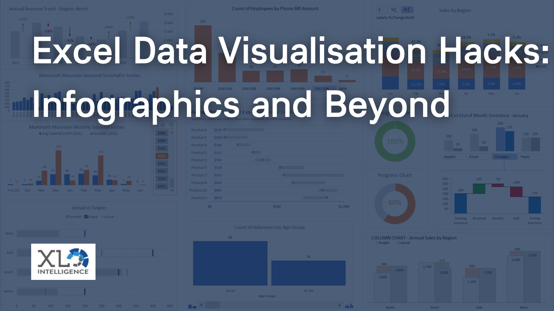
Advanced Excel charting techniques
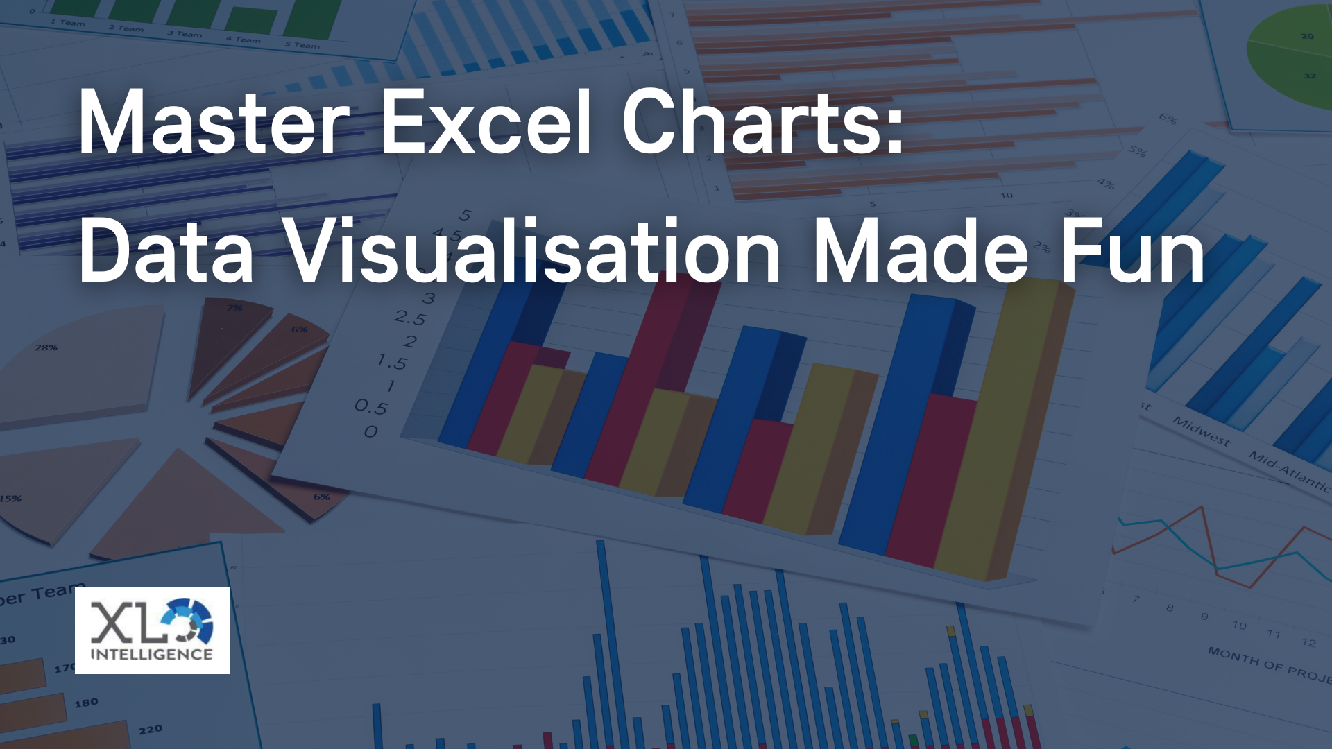
Welcome to a journey where data meets creativity, where numbers transform into compelling visuals, and where you become the master of Excel charts. At XL Intelligence, we're excited to guide you through advanced Excel charting techniques that will not only enhance your data presentation skills but also make data visualisation an enjoyable task. In this article, we'll delve deep into the world of Excel charts, sharing expert insights and real-world experiences to help you unlock the full potential of Excel for data visualisation.
Exploring Advanced Excel Chart Types
Understanding the Chart Landscape
Before we dive into advanced techniques, let's begin with a quick overview of the chart types available in Excel. Knowing which chart type to use for your data is crucial for effective visualisation.
Excel offers a variety of chart types, including line charts, bar charts, and pie charts. Each chart type serves a specific purpose, and selecting the right one can significantly impact the clarity of your message. Here at XL Intelligence, we've found that understanding the fundamentals is key to mastering advanced techniques.
Customising Charts for Impactful Data Representation
The Art of Chart Formatting
Once you've selected the appropriate chart type, the next step is to customise it for maximum impact. XL Intelligence believes that chart formatting is an art that can transform dull visuals into compelling ones.
We'll explore advanced chart design techniques such as colour schemes, data labels, and trendlines. These elements not only make your charts visually appealing but also help convey your message more effectively.
Using XL Intelligence's Design Strategies
Our team at XL Intelligence has extensive experience in designing charts that leave a lasting impression. Throughout this section, we'll share our design strategies and tips to help you create charts that stand out and capture your audience's attention.
Interactive Charts with Excel's Advanced Features
Enhancing User Engagement
In today's data-driven world, interactivity is key. Excel offers advanced features like PivotCharts, Slicers, and Data Validation that allow users to interact with your charts dynamically.
We'll show you how to integrate these features into your charts to create interactive data visualisations that engage your audience and provide valuable insights.
XL Intelligence's Tips for User Engagement
At XL Intelligence, we believe that interactive charts are not just about functionality but also about user experience. We'll share our expert tips for ensuring a seamless and engaging user experience when working with interactive charts.
Data Analysis and Chart Automation
Unlocking Advanced Data Analysis Techniques
Data visualisation is not just about pretty charts; it's also about deriving meaningful insights from data. We'll delve into advanced data analysis techniques such as regression analysis and forecasting, showing you how to apply them in Excel to make data-driven decisions.
Automating Charts with Macros
Time is precious, and automation can be a game-changer. XL Intelligence will guide you through automating chart creation and updates using macros, streamlining your data visualisation workflow.
Collaborative Data Visualisation with Excel
The Power of Collaboration
In today's globalised world, collaboration is essential. Excel, with its Office 365 integration, offers robust collaboration features that enable teams to work together on data visualisations in real time.
We'll explore how to share Excel charts, collaborate effectively, and present case studies showcasing successful collaborative projects undertaken by XL Intelligence.
Conclusion
In this comprehensive guide, we've explored advanced Excel charting techniques that empower you to create visually stunning and informative data visualisations. We've highlighted XL Intelligence's expertise and shared personal anecdotes to illustrate the concepts.
Now, armed with these advanced techniques, you can transform your data into impactful visuals that drive better decision-making and captivate your audience.
Call to Action
Ready to take your Excel charting skills to the next level? Connect with XL Intelligence today and let us help you become a master of data visualisation. Visit our
contact page to get in touch and embark on a data visualisation journey that combines expertise with creativity. Don't miss out on the opportunity to make data visualisation both fun and informative!
Get in Touch

We specialise in Advanced Excel training, Dashboard development, Data Analysis, Power BI and VBA. We also provide training with, both standard and customised courses to suit your organisation’s needs.
Address
2, 26 Linden Gardens London W2 4ES
Phone
07737 707 548