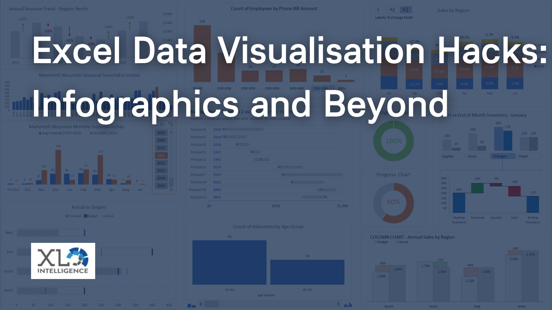
Visual data is essential in conveying information effectively and efficiently. It can make complex data easier to understand and more visually appealing, helping to draw the reader in and encourage engagement.
Data visualisations are powerful tools that can help us make sense of complex data sets. When designed well, they can be both visually appealing and meaningful, conveying important insights and information to the audience. Let’s walk through 5 steps on creating visually appealing and meaningful data.
Step 1: Define the Purpose
Before creating any data visualisations, it is essential to define the purpose of the visualisation. This involves identifying the message you want to convey and the target audience. It is important to have a clear understanding of the goals of the visualisation and how it will be used. This will help guide the design process and ensure that the final product is relevant and effective. [1]
Step 2: Choose the Right Visualisation
Once the purpose of the visualisation is defined, the next step is to choose the right type of visualisation to convey the message effectively. There are various types of visualisations available, such as bar charts, line charts, pie charts, scatter plots, and heat maps, each suited to different types of data and messages. Choosing the right visualisation involves considering the data type, the message to be conveyed, and the target audience. For example, a scatter plot may be useful for showing the correlation between two variables, while a heat map may be useful for displaying geographic data. [2]
Step 3: Collect the Data
After defining the purpose and choosing the right visualisation, the next step is to collect the data required for the visualisation. This involves identifying the relevant data sources and ensuring that the data is accurate, complete, and reliable. It is important to keep in mind the type of visualisation chosen in step 2 and ensure that the data collected is suitable for that visualisation. For example, if a line chart is chosen, the data collected must have a time component. [3]
Step 4: Prepare the Data
Once the data is collected, it is essential to prepare the data for the visualisation. This involves cleaning and transforming the data to ensure that it is ready for analysis and visualisation. Data cleaning involves removing duplicates, correcting errors, and filling in missing data, while data transformation involves converting data to a suitable format for visualisation. This step is crucial as the accuracy and effectiveness of the visualisation depend on the quality of the data used. [4]
Step 5: Visualise the Data
Finally, after defining the purpose, choosing the right visualisation, collecting the data, and preparing the data, the last step is to create the actual data visualisation. This involves designing the visualisation to convey the message effectively, using appropriate colours, labels, and annotations to make it visually appealing and meaningful. It is important to keep in mind the target audience and ensure that the visualisation is easy to understand and interpret. Testing the visualisation with a sample audience and incorporating feedback can also help to refine the final product. [5]
Creating visually appealing and meaningful data visualisations involves a systematic process that includes defining the purpose, choosing the right visualisation, collecting the data, preparing the data and visualising the data. By following these five steps, you can create data visualisations that are both aesthetically pleasing and effective in communicating important insights and information to your target audience.
For more of the latest Excel news please head to our News page.
To book an
Excel consultation service with our Excel professionals,
click here


