It's automatic!

In today's fast-paced world, businesses need to make quick decisions based on the data available to them. Excel is a powerful tool that can help you analyse data and create visual representations such as charts and graphs. However, manually updating reports can be time-consuming and prone to errors. In this article, we will show you how to automate Excel reports to create dynamic dashboards and charts that update automatically.
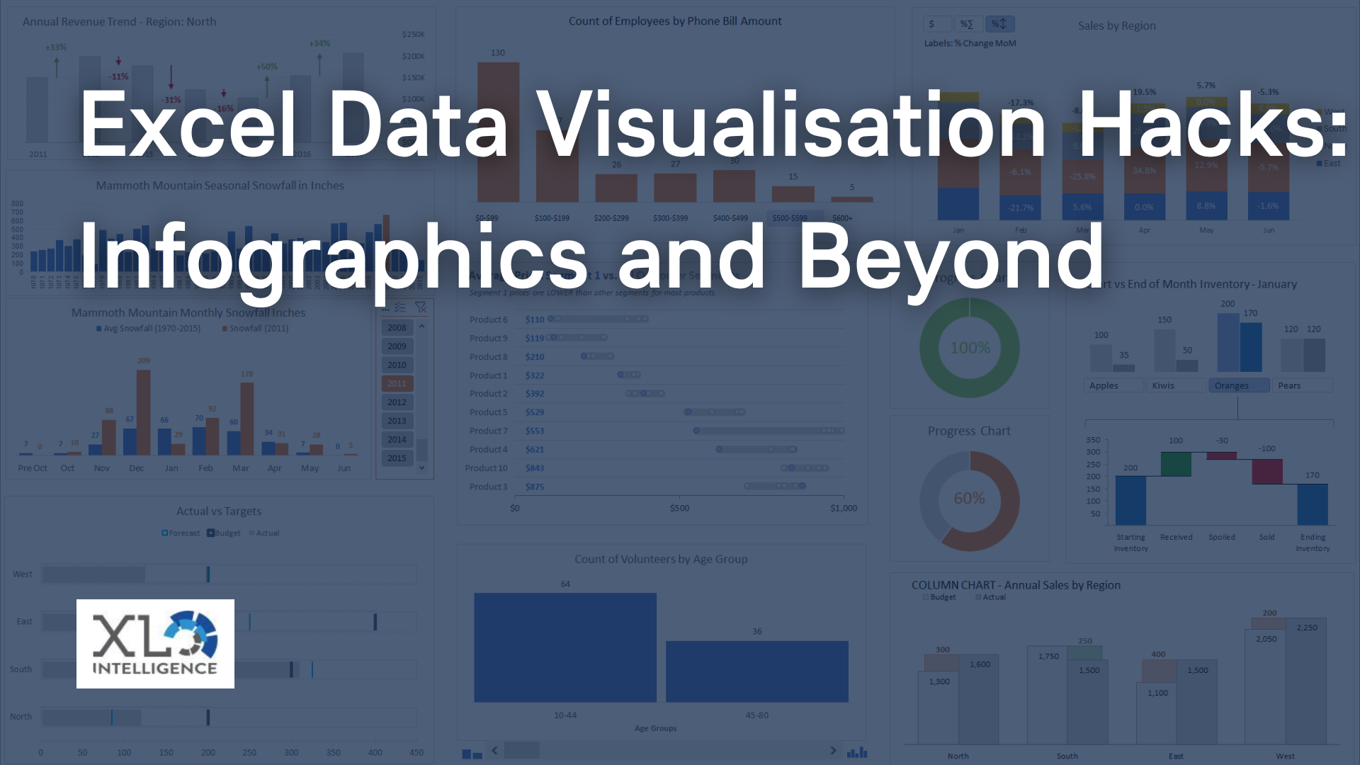
Here at XL Intelligence, we offer training courses on both Microsoft Excel and VBA and Microsoft Power BI, many of which cover some very specific elements and features of both programs. Ready to book? Click HERE now to enrol on one our courses.
Understanding Pivot Tables
Pivot tables are an essential tool for automating Excel reports. They allow you to summarise large amounts of data into a compact format and analyse it from different perspectives. To create a pivot table, select the data you want to summarise and go to the Insert tab. Click on the PivotTable button and choose the location where you want to place your pivot table. You can also create a pivot table from an existing one by clicking on the Analyse tab and selecting PivotTable from the ribbon.
Creating Pivot Charts
Pivot charts are a great way to visualise your pivot table data. They allow you to create charts and graphs that update automatically as you modify your pivot table. To create a pivot chart, select any cell within your pivot table and go to the PivotTable Tools tab. Click on the Analyse tab and select PivotChart. Choose the chart type that best fits your data and customise it as desired.
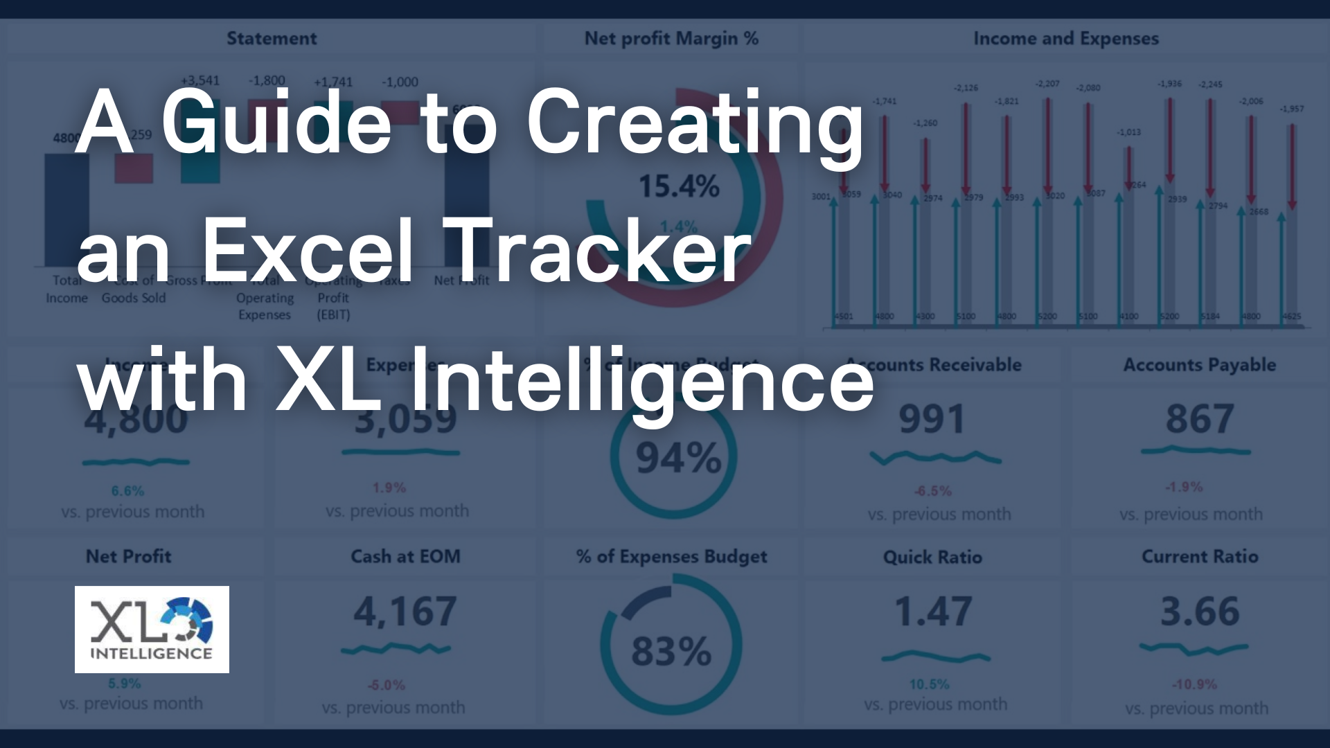
Building a Dashboard
A dashboard is a visual representation of your data that provides an at-a-glance view of your key performance indicators (KPIs). Dashboards can help you quickly identify trends and make informed decisions. To build a dashboard, you can use a combination of pivot tables, pivot charts, and other Excel tools such as slicers and timelines. Arrange your charts and tables on a separate worksheet and format them as desired.
Automating Reports
Manually updating reports can be time-consuming and prone to errors. Fortunately, Excel provides several tools that can help you automate reports. One such tool is macros. Macros are sets of instructions that automate repetitive tasks. To create a macro, go to the View tab and click on Macros. Choose the name for your macro and record the steps you want it to perform. You can then assign a shortcut key to your macro and use it to automate your reports.
Another way to automate reports is to use Power BI. Power BI is a business analytics service that allows you to create interactive reports and dashboards. You can connect to various data sources, including Excel, and create reports that update automatically as your data changes.
Excel is a powerful tool that can help you analyse data and create visual representations such as charts and graphs. Automating Excel reports can save you time and improve the accuracy of your data. By using pivot tables, pivot charts, dashboards, macros and Power BI, you can create dynamic reports that update automatically and provide valuable insights into your business.
Click
HERE to read the latest news on
Microsoft Excel,
VBA and
Microsoft Power BI.
Get in Touch