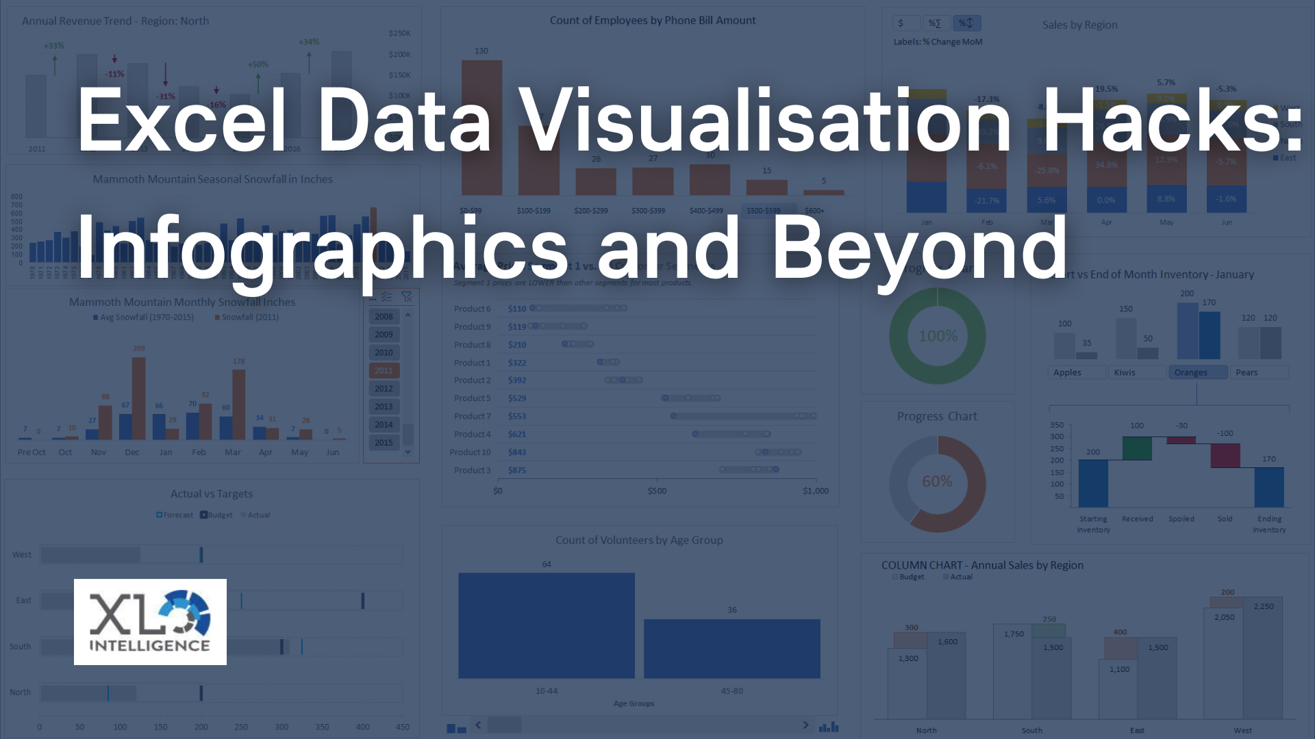
With the right tools, creating custom charts and graphs can be a powerful way to help you better understand and share your data.

Creating custom charts and graphs can be a powerful way to visualise and communicate data effectively. In this blog post, we will explore the steps involved in creating custom charts and graphs, as well as some best practices for designing visually appealing and informative visuals.
Determine the Purpose and Audience of Your Chart or Graph
Before you begin creating a custom chart or graph, it's important to understand the purpose and audience of your visual. Are you trying to show trends over time, compare different categories or variables, or highlight outliers in your data? Understanding the purpose of your chart or graph will help you select the appropriate chart type and design a visual that effectively communicates your message to your intended audience.
Choose the Right Chart Type
Once you have a clear understanding of the purpose of your chart or graph, it's time to choose the right chart type. There are many different chart types to choose from, including line charts, bar charts, pie charts, scatter plots, and more. Each chart type is best suited to a particular type of data and message you want to convey. For example, if you want to show changes over time, a line chart may be the best choice, while a bar chart is often used to compare different categories.
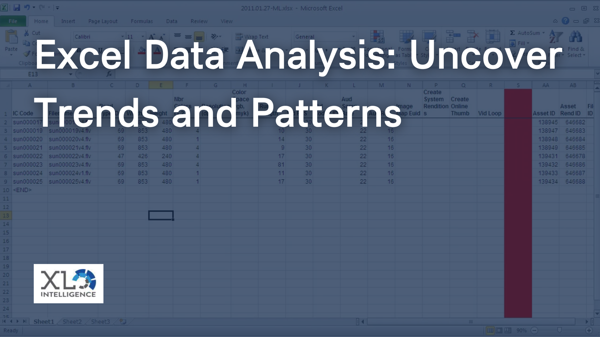
Collect and Prepare Your Data
Before you start creating your custom chart or graph, you need to collect and prepare your data. This may involve cleaning and organising your data in a spreadsheet, choosing which variables to include, and selecting appropriate labels and units for your axes.
Design Your Chart or Graph
With your data prepared, it's time to design your custom chart or graph. This involves selecting appropriate colours, fonts, and styles that will help your visual stand out and communicate your message effectively. You should also consider adding annotations, such as labels or text boxes, to highlight key data points or trends.
Test and Refine Your Chart or Graph
Once you have designed your custom chart or graph, it's important to test and refine your visual to ensure it effectively communicates your message. You may want to show your chart or graph to colleagues or friends and gather feedback on how well it communicates your message.
Best Practices for Creating Custom Charts and Graphs
- Keep it Simple: Avoid cluttering your chart or graph with too much data or design elements.
- Use Appropriate Scales: Choose scales for your axes that make it easy to read and interpret your data.
- Label Everything: Ensure that all elements of your chart or graph are labelled clearly, including axes, data points, and legends.
- Use Colour Wisely: Choose colours that make it easy to distinguish between different categories or data points, but avoid using too many colours or colours that clash.
- Test and Refine: Be willing to make changes to your chart or graph based on feedback from others, and test it thoroughly to ensure it communicates your message effectively.
In conclusion, creating custom charts and graphs can be a powerful tool for communicating data effectively. By following the steps outlined above and keeping best practices in mind, you can design visually appealing and informative visuals that effectively communicate your message to your intended audience.
For more of the latest news about Microsoft
Excel &
Power BI click
HERE.
Get in Touch


We specialise in Advanced Excel training, Dashboard development, Data Analysis, Power BI and VBA. We also provide training with, both standard and customised courses to suit your organisation’s needs.
Address
2, 26 Linden Gardens London W2 4ES
Phone
07737 707 548