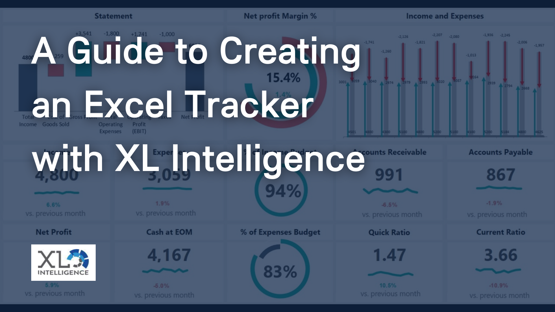
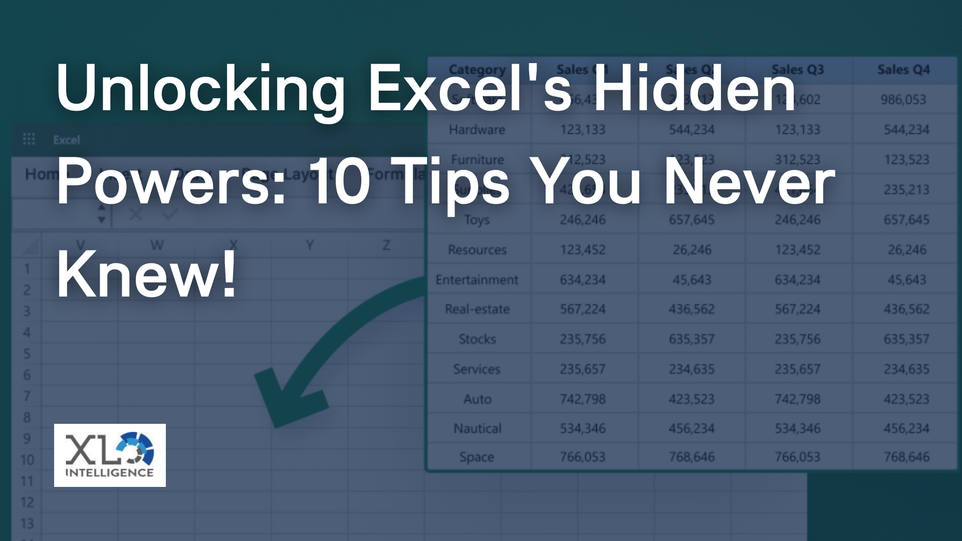
Tell your data story

Welcome to the world of Power BI, where data comes alive through interactive reports that captivate audiences and deliver actionable insights. As a Dashboard expert, specialising in Power BI at XL Intelligence, we understand the power of compelling data storytelling and the impact it can have on decision-making. In this article, we will guide you through the art of creating engaging Power BI dashboards that will elevate your data presentations to a whole new level.
Understanding Power BI Interactive Report Design
Before we dive into the technical aspects of creating interactive reports, let's take a moment to grasp the essence of Power BI interactive report design. At its core, it's about turning raw data into an engaging story that speaks to your audience. As the saying goes, "a picture is worth a thousand words," and in the world of data analytics, visuals play a crucial role in conveying complex information.
Effective Power BI dashboard design revolves around catering to your audience's needs and delivering a user-centric experience. When crafting your dashboard, put yourself in the shoes of the end-users, whether they are stakeholders, managers, or clients, and ask yourself what data and insights they seek.
Planning Your Power BI Dashboard
Like any successful project, a well-thought-out plan is essential for creating an impactful Power BI dashboard. Here are the key steps to take during the planning phase:
Identify Your Audience: Understand who will be using the dashboard and what they expect to achieve with the data. Tailor your visualisations and storytelling approach to suit their needs.
Define Objectives and KPIs: Clearly outline the goals of your dashboard and the Key Performance Indicators (KPIs) that will measure success. This will help you focus on the most critical data points.
Data Sources and Modeling: Identify the data sources you will be using and ensure they are clean and well-structured. Power BI's data modelling capabilities are robust, allowing you to create relationships between tables and customise data according to your requirements.
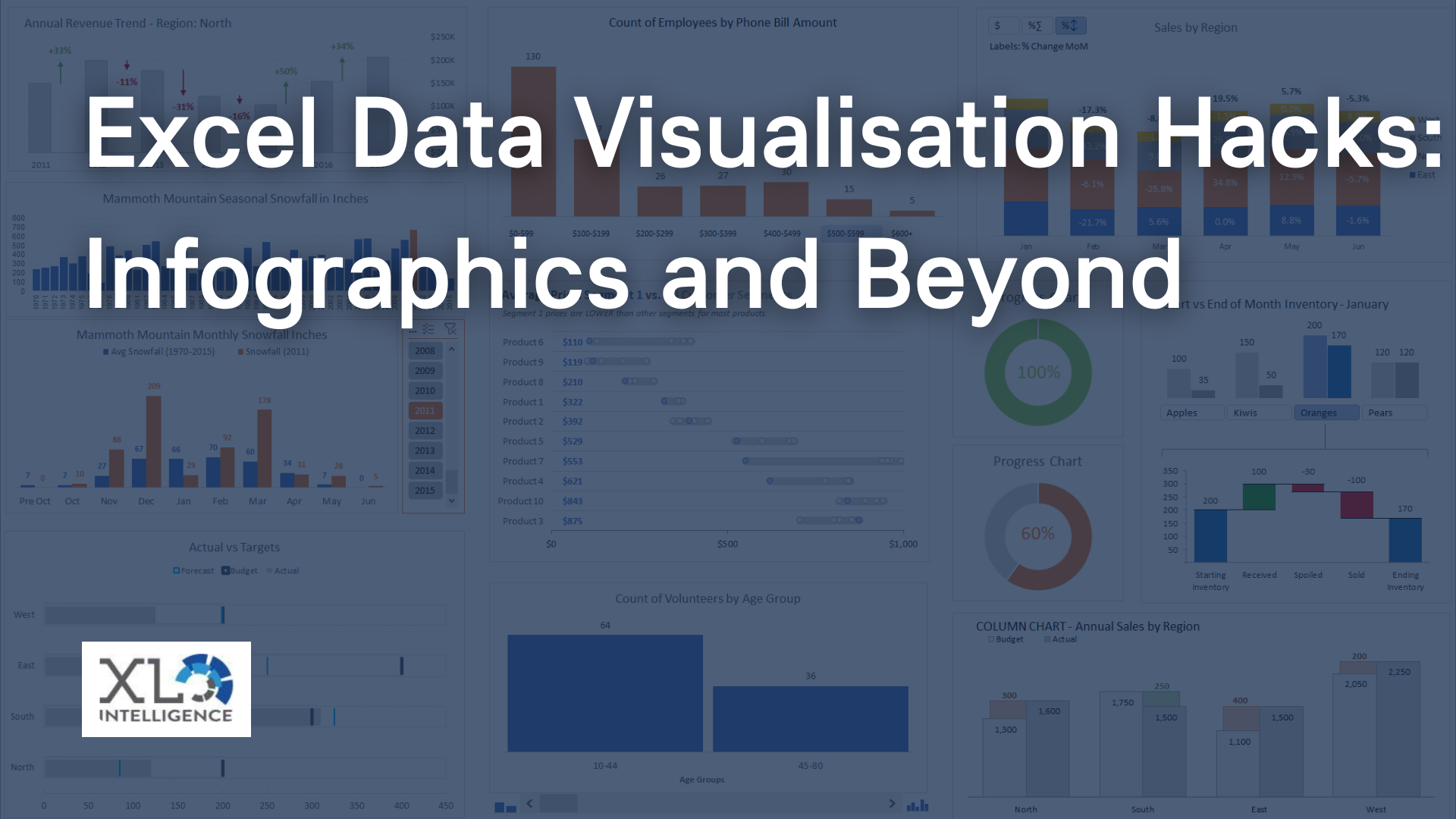
Designing Engaging Data Visualisations
The heart of any Power BI dashboard lies in its data visualisations. Let's explore how you can create visually stunning and informative charts:
Choosing the Right Chart Types: Selecting appropriate chart types is essential to effectively communicate your data. Consider the nature of your data—whether it's categorical, numerical, or time-based—and choose charts such as bar graphs, line charts, scatter plots, and heat maps accordingly.
Design Principles: Apply design principles like simplicity, consistency, and balance to make your dashboard visually appealing. Avoid clutter and unnecessary elements that might distract users from the main insights.
Colour and Themes: Use colours purposefully to convey information and create a harmonious visual experience. Themes allow you to maintain consistency throughout the dashboard, reflecting your brand identity.
Personal Anecdote:
Once, while designing a sales performance dashboard for a retail client, we used a traffic light colour scheme for KPIs, where red indicated underperformance, yellow indicated moderate performance, and green indicated outstanding performance. This simple yet powerful design choice made it easy for the client's executives to quickly assess the health of their sales figures, leading to better decision-making.
Enhancing Interactivity and User Experience
Interactivity is the soul of a Power BI dashboard, enabling users to explore data and discover insights on their own. Here's how you can enhance interactivity:
Slicers and Filters: Implement slicers and filters to allow users to slice and dice the data as per their preferences. This feature empowers them to focus on specific aspects of the data and gain deeper insights.
Custom Navigation: Design interactive buttons or hierarchical navigation systems that guide users through different sections of the dashboard. This creates a seamless user experience.
Tooltips and Bookmarks: Provide additional context to visualisations using tooltips and create bookmarks to save custom views, helping users recall specific data scenarios effortlessly.
Leveraging Advanced Power BI Features
To take your Power BI dashboards to the next level, explore the following advanced features:
DAX (Data Analysis Expressions):
DAX allows you to create custom calculations, measures, and aggregations, enabling complex data analysis beyond what standard functions can achieve.
Custom Visuals and Third-Party Integrations:
Power BI's marketplace offers a wide array of custom visuals and integrations with other tools, expanding the range of possibilities for data visualisation and analysis.
Power BI's AI Capabilities: Harness the power of AI-driven insights for predictive analytics, anomaly detection, and natural language queries, making your dashboard more intelligent and user-friendly.
Telling a Data Story with Your Power BI Dashboard
An engaging Power BI dashboard is not just a collection of visuals but a coherent data story. Here's how you can weave your data into a compelling narrative:
Structuring the Narrative:
Organise your dashboard in a logical flow, guiding users through the data from the beginning to the end. This structure should align with your defined objectives and KPIs.
Annotations and Callouts:
Use annotations and callouts to draw attention to critical data points or trends. Explain the significance of these insights to help users grasp their implications.
Contextualizing Data Findings: Provide context to your data by integrating external information or explaining changes in trends over time. This enables users to make well-informed decisions.
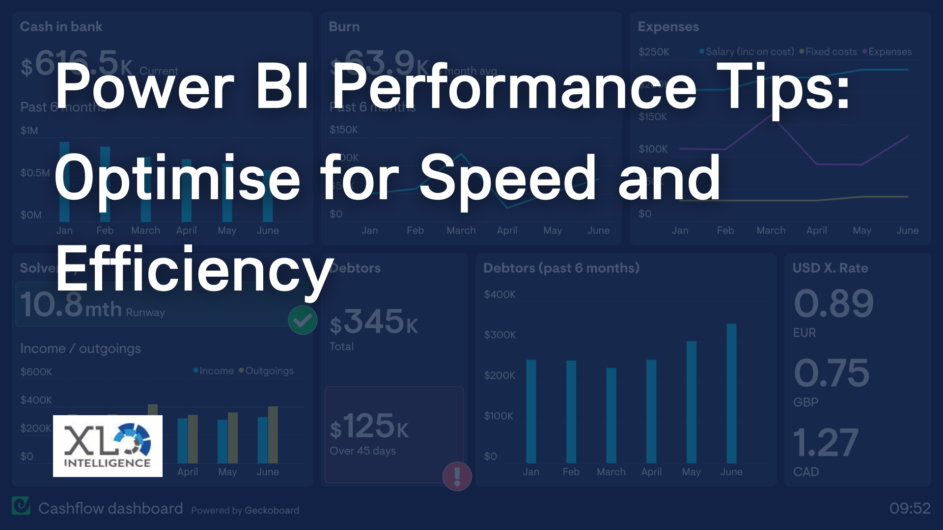
Optimising Performance and Responsiveness
A well-designed Power BI dashboard should not only be visually appealing but also efficient in performance. Consider the following optimization techniques:
Reducing Load Times:
Minimise loading times by optimising data models and avoiding unnecessary data connections. This ensures that users can access insights swiftly.
Data Model Optimization: Compress data models to reduce file sizes and improve overall performance. Utilise Power BI's built-in tools for optimising data models.
Cloud Capabilities:
Leverage the cloud capabilities of Power BI for seamless sharing and collaboration. Share your interactive report securely with others for collaborative data analysis.
Deploying and Sharing Your Power BI Dashboard
Once you've created your masterpiece, it's time to share it with your audience. Here's how you can effectively deploy and share your Power BI dashboard:
Export and Publish:
Export your interactive report to various formats like PDF, PowerPoint, or publish it to the Power BI service for easy access.
Access Permissions and Security: Control who can view and interact with your dashboard by configuring access permissions and security settings.
User Feedback and Iterative Improvements: Gather user feedback and analyse usage data to identify areas for improvement. Iteratively enhance your dashboard based on user needs and preferences.
Conclusion
Congratulations! You are now equipped with the knowledge and techniques to create interactive reports with Power BI that captivate audiences and convey meaningful insights. As a Dashboard expert at Xl Intelligence, we are passionate about empowering individuals like you to tell powerful data stories.
So, go ahead and embark on your Power BI journey. Start creating engaging and interactive dashboards that unlock the true potential of your data. If you have any questions or need assistance, don't hesitate to
contact us for expert guidance and support.
Now, let your data speak for itself and make an impact with captivating Power BI dashboards!
Get in Touch