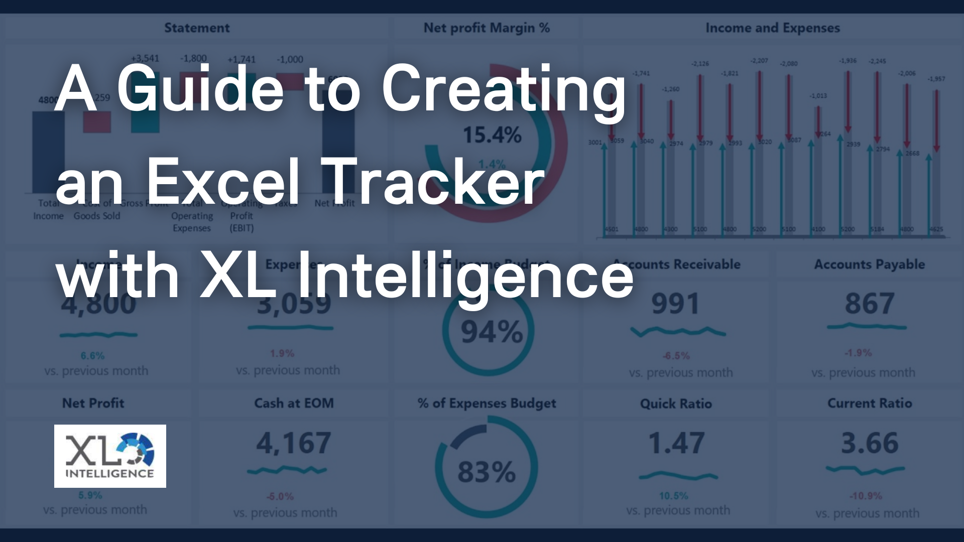
XL Intelligence - 8 Expert Dashboard Design Principles You Should Know
Designing an effective dashboard is a critical skill for any data analyst or business intelligence professional. A well-designed dashboard can help users understand complex data sets and make better decisions. However, designing a good dashboard is not easy. There are many factors to consider, such as the data sources, the layout, and the visualisations. There are some general principles that all designers should keep in mind when designing a dashboard.
These principles can help you create an effective and beautiful dashboard.
1. Keep it Simple
The first principle of dashboard design is to keep it simple. A dashboard should not be overloaded with information. It should only include the most important data that the user needs to see. This data should be presented in a way that is easy to understand. The dashboard should be free of clutter and unnecessary elements.
2. Use a White Space
White space is an important element of any design. It can help to create a sense of order and calm. On a dashboard, white space can help to highlight the most important elements. It can also make the dashboard appear less busy and easier to use.
3. Use Strong Visuals
Visualisations are an important part of any dashboard. They can help to make complex data sets more understandable. When choosing visualisations, it is important to use ones that are easy to understand and interpret. Strong visuals can also help to make the dashboard more visually appealing.
4. Use Contrasting Colours
Contrasting colours can help to make data more understandable. They can also help to make the dashboard more visually appealing. When choosing colours, it is important to use ones that are easy to read and that have high contrast.
5. Limit the Number of Colours
It is important to limit the number of colours used on a dashboard. Too many colours can make the dashboard appear busy and can make data more difficult to interpret. It is best to use a limited colour palette that includes a few contrasting colours.
6. Use Visual Hierarchy
Visual hierarchy is the order in which the human eye perceives visual elements. When creating a dashboard, it is important to use a visual hierarchy to ensure that the most important information is presented first.
The best way to create a visual hierarchy is to use contrasting colours and font sizes. For example, the most important information on a dashboard could be displayed in a large font size with a bright colour. In contrast, less important information could be displayed in a smaller font size with a darker colour.
7. Choose the Right Data Sources
The data sources that are used to populate a dashboard can have a big impact on its effectiveness. It is important to choose data sources that are accurate and up-to-date.
In addition, the data sources should be chosen to provide the information that is most important to the dashboard's users. For example, if a dashboard is being created for sales managers, the data sources should be chosen so that they provide information about sales.
8. Test, Test, Test
It is important to test a dashboard before it is released to users. The testing process should include both usability testing and data validation.
Usability testing is important to ensure that the dashboard is easy to use and that users can find the information they are looking for. Data validation is important to ensure that the data being displayed on the dashboard is accurate.
Conclusion
There are many different dashboard design principles that top designers use to create an effective and user-friendly dashboard. Some of the most important principles include using clear and concise language, choosing the right chart type for the data, and ensuring that the dashboard is visually appealing. By following these principles, designers can create dashboards that are both easy to use and informative.
If you're looking for
Excel dashboard training, contact XL Intelligence. We specialise in
Advanced Excel training,
Dashboard development,
Data Analysis,
Power BI and
VBA. We also provide training with both standard and customised courses to suit your organisation's needs. Discuss your business intelligence needs by reaching out to our team today!
Get in Touch


We specialise in Advanced Excel training, Dashboard development, Data Analysis, Power BI and VBA. We also provide training with, both standard and customised courses to suit your organisation’s needs.
Address
2, 26 Linden Gardens London W2 4ES
Phone
07737 707 548