It's worth investing time into learning how to use your dashboard effectively.

In today's business world, companies have access to more data than ever before. However, managing and analysing this data can be a challenge, especially when it is scattered across multiple platforms and systems. This is where dashboards come in. Dashboards offer a method of consolidating company data into one unified location with secure data storage. Dashboards are designed to offer a comprehensive overview of company performance, and do so through the use of data visualisation tools like charts and graphs. These tools are auto-generated, so you don't need to be an expert to use them.
Looking to book your training courses now?
Click here to see a full list of our services.
In this blog article, we will explore the benefits of dashboard development, and how dashboards can help businesses make informed decisions. We will also discuss the best practices for designing effective dashboards and offer tips on how to make the most out of them.
What are Dashboards?
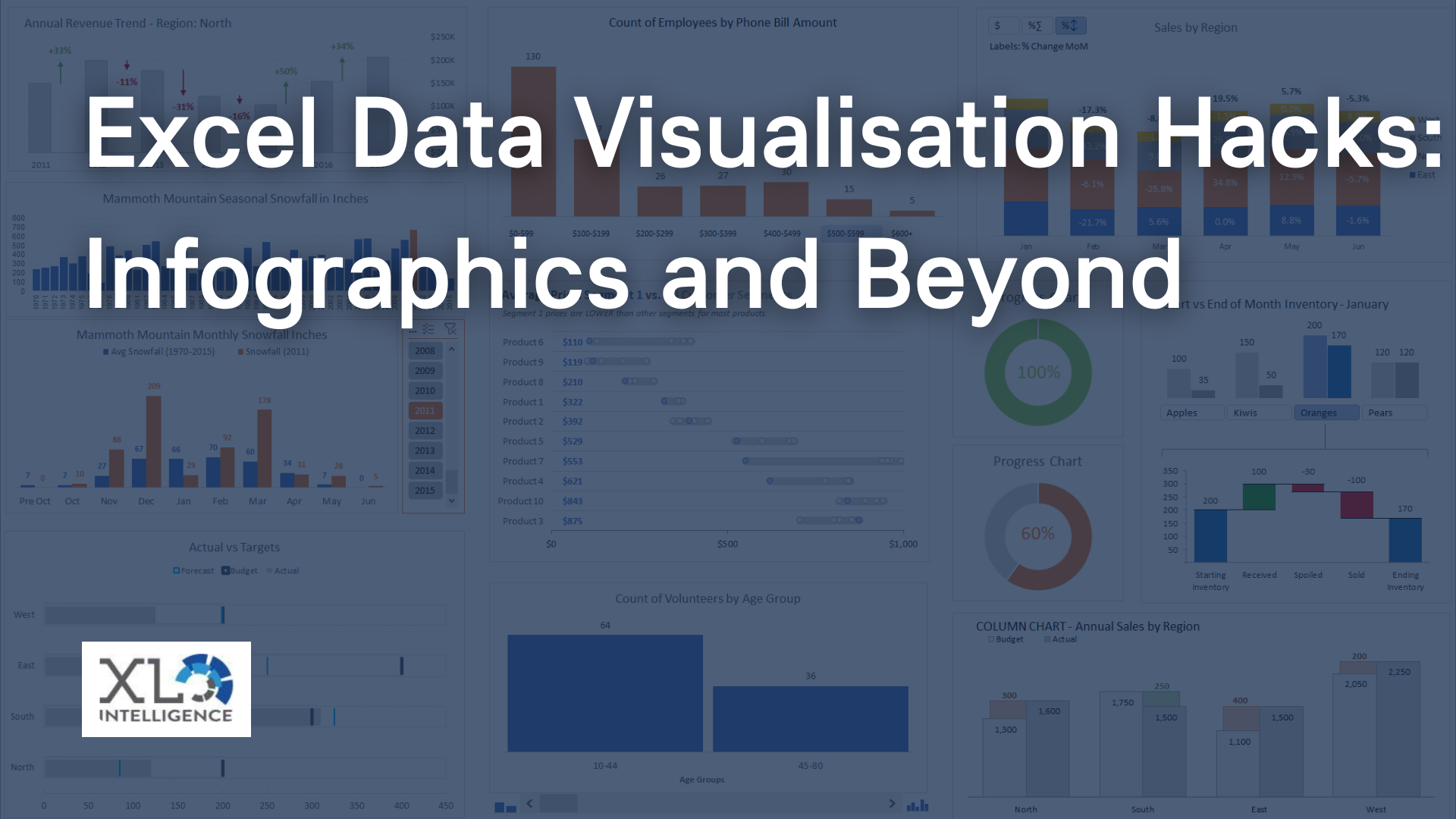
Dashboards are visual representations of data that consolidate information from multiple sources into a single location. They are designed to provide a comprehensive overview of a company's performance, making it easier for decision-makers to identify trends and patterns. Dashboards use data visualisation tools like charts, graphs, and tables to help users understand complex data sets quickly.
Why are Dashboards Important?
Dashboards are essential for businesses of all sizes because they provide a way to track key performance indicators (KPIs) and identify trends in real-time. With a dashboard, businesses can quickly see where they stand and make informed decisions based on the data. Dashboards also provide a way to share information with stakeholders, making it easier to communicate progress and identify areas for improvement.
According to a study by Aberdeen Group, companies that use dashboards are 50% more likely to meet their revenue goals than those that do not. This shows that dashboards are not just nice to have, but they are essential for businesses that want to succeed.
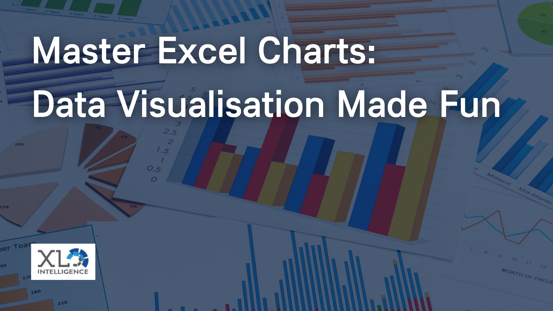
Types of Dashboard Visualisations
Dashboard-centric charts and visualisations fall into four primary categories that are related to the aim of the visualisation: relationship, distribution, composition, and comparison. It is important to understand the aim of the metric before picking the chart type that you want.
Relationship Visualisations
Relationship visualisations are used to show the relationship between two or more variables. Examples of relationship visualisations include scatter plots, bubble charts, and network graphs.
Distribution Visualisations
Distribution visualisations are used to show the distribution of data. Examples of distribution visualisations include histograms, frequency polygons and box plots.
Composition Visualisations
Composition visualisations are used to show how a whole is divided into parts. Examples of composition visualisations include pie charts, stacked bar charts and tree maps.
Comparison Visualisations
Comparison visualisations are used to compare two or more variables. Examples of comparison visual include charts, graphs and maps, which provide an accessible way to see and understand trends, outliers and patterns in data
Ready to
learn more? Contact us today,
click here and one our team will be in touch.
Get in Touch


We specialise in Advanced Excel training, Dashboard development, Data Analysis, Power BI and VBA. We also provide training with, both standard and customised courses to suit your organisation’s needs.
Address
2, 26 Linden Gardens London W2 4ES
Phone
07737 707 548