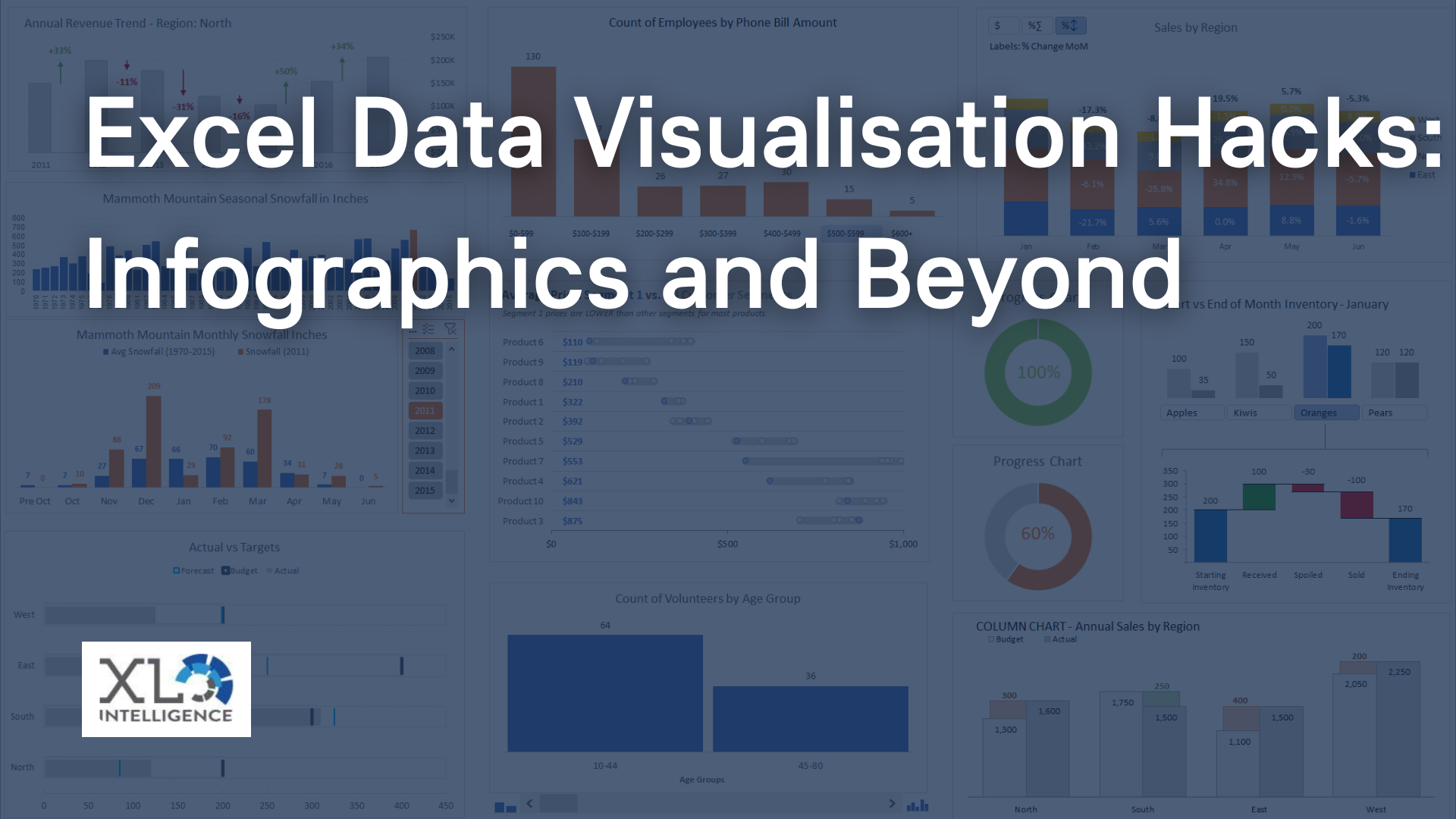
Interactive data visualisation is a powerful tool that can help organisations to make informed decisions faster.

The use of interactive visuals to display data allows users to see trends, patterns and relationships in their data that might not have been apparent before. This article will explore the benefits of interactive data visualisation and provide tips on how to maximise its use.
Ready to discuss your business intelligence needs? We work with organisations across a wide range of industries including legal, IT, finance, engineering and psychology. Click HERE now to see how we can help with your training and consultancy needs.
Benefits of Interactive Data Visualisation
Faster Action
The human brain tends to process visual information faster than written reports. In fact, 93% of human communication is visual, meaning we process images 60,000 times faster than we do on the text. Interactive data visualisation makes it easy to see trends and patterns in data, allowing users to take action quickly.
Multiple Questions
Interactive data visualisation allows users to pose multiple questions per visualisation. Users can switch axes or add confabulating factors, which can be very useful for survey data. It allows viewers to break down responses to a specific question by gender, age or occupation.
Identifying Trends and Relationships
Humans are way better at processing visual data than plain text. Being able to see and directly rearrange data makes it easier to acquire information and act on it accordingly. Interactive data visualisation helps identify trends and relationships in the data, making it easier to see the big picture.
Understanding and Retaining Information
Humans are visual creatures, and interactive data visualisation provides the best results, making it easy for audiences to understand and retain information. Produced by specific tools, such as BI software, interactive data visualisation content is essential to demonstrate data evolution or regression in a simple and understandable way.
In-depth Analysis
Creating an interactive visualisation requires the use of data analysis tools or software that allows the user to extract, transform, and manipulate data to display it graphically in a report. This type of representation ensures that all the key points of interest are neatly organised and portrayed. It also allows for an in-depth analysis of each of these elements.
Tips for Maximising the Benefits of Interactive Data Visualisation
Choose the Right Data Visualisation Tool
Choosing the right data visualisation tool is critical. The right tool should be able to handle large amounts of data, offer various data visualisation options, and be user-friendly.
Know Your Data
Before creating an interactive visualisation, it is essential to know your data inside and out. Understanding your data can help you choose the right visualisation type and ensure that the data is accurately represented.
Keep it Simple
Interactive data visualisation should be easy to understand and use. Avoid adding too many elements, which can overwhelm the user.
Design for Your Audience
The interactive data visualisation should be designed with the audience in mind. Understanding the audience's needs and preferences can help create visuals that are easy to understand and use.
Test and Refine
Interactive data visualisation is an iterative process. It is essential to test and refine the visualisation to ensure that it meets the user's needs and effectively communicates the data.
Interactive data visualisation is a powerful tool that can help organisations make informed decisions faster. The use of interactive visuals to display data allows users to see trends, patterns and relationships in their data that might not have been apparent before. To maximise the benefits of interactive data visualisation, it is essential to choose the right tool, know your data, keep it simple, design for your audience, and test and refine the visualisation. By following these tips, organisations can unlock the full potential of their data and gain valuable insights.
You can read the latest on Advanced
Excel
training,
Dashboard development,
Data Analysis,
Power BI and
VBA
HERE.

