Data visualisation has become increasingly important in today's world as it allows us to quickly and easily communicate complex information to a wide audience. Visualisations can help to identify trends, highlight correlations, and simplify data sets. By presenting data in an accessible and visually appealing way, data visualisations can be an invaluable tool for making informed decisions.
Data visualisation can be used in a variety of ways, from providing an overview of key findings to communicating complex research topics to a wide audience. Effective visualisations are aesthetically pleasing and easy to interpret, helping to present data in a more meaningful and engaging way.
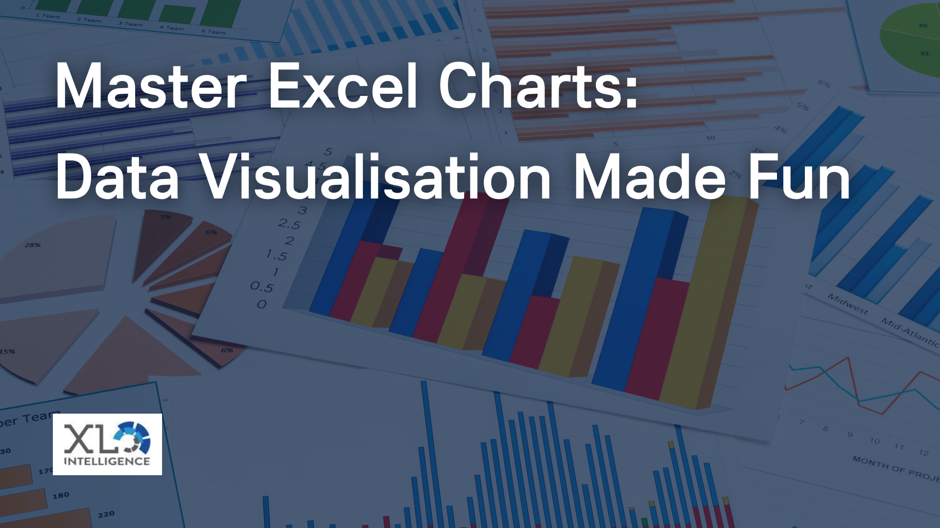
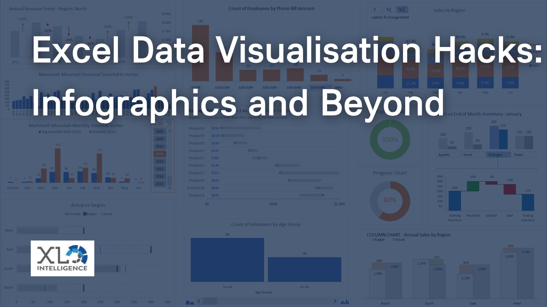
Common types of data visualisation include charts, graphs, maps, and diagrams. Charts are often used to compare data points, while graphs are used to show relationships between data points. Maps can be used to represent geographical data, while diagrams are a useful tool for illustrating processes.
Data visualisation is an incredibly powerful tool for communicating complex information in an accessible and engaging way. By presenting data in an aesthetically pleasing way, data visualisations help to make complex topics more understandable for a wider audience. Whether you're a business, a marketer, or a scientist, data visualisation can be an invaluable tool for making informed decisions.
You can read more on our training here https://www.xlintelligence.co.uk/power-bi-data-visualisation-for-end-users
Get in touch today and we can discuss your training needs and what you are looking to achieve.
Get in Touch


We specialise in Advanced Excel training, Dashboard development, Data Analysis, Power BI and VBA. We also provide training with, both standard and customised courses to suit your organisation’s needs.
Address
2, 26 Linden Gardens London W2 4ES
Phone
07737 707 548