Power BI vs. Tableau comparison

Welcome to the ultimate data visualisation showdown between Power BI and Tableau! Picture this: two heavyweight contenders stepping into the ring, armed with powerful features and the ability to transform raw data into beautiful insights. As a data analyst and director of XL Intelligence, choosing the right tool can be a game-changer for your career. In this article, we'll embark on an epic journey through the world of data visualisation, comparing the strengths, weaknesses, and unique characteristics of Power BI and Tableau. So, put on your analyst gloves and get ready for an exhilarating battle!
Overview of Power BI and Tableau
A. Power BI: The Microsoft Marvel
Let's kick off with Power BI, the superhero of data visualisation tools brought to you by Microsoft. If you're familiar with the Microsoft ecosystem, Power BI seamlessly integrates with other Microsoft tools and services. It's like having a trusty sidekick, always ready to lend a hand when you need to analyse and visualise data.
B. Tableau: The Artistic Virtuoso
Now, let's meet Tableau, the maestro of data visualisation. Tableau is known for its flexibility and ease of use, empowering data analysts to create stunning visualisations with a few clicks. It's like having a paintbrush in your hand, ready to transform raw data into a captivating masterpiece.
Data Visualisation Capabilities
A. Power BI: Crafting Visual Masterpieces
Power BI offers an impressive array of visualisations and chart types to help you bring your data to life. From classic bar charts to interactive maps, Power BI has got you covered. With its intuitive drag-and-drop interface, you can create captivating dashboards and reports that captivate your audience and make data analysis an enjoyable experience.
B. Tableau: Painting with Data
Tableau takes data visualisation to a whole new level. Its rich set of visualisations and chart types allows you to unleash your creativity and tell a compelling data story. Imagine transforming a mundane dataset into a mesmerising infographic or an interactive data-driven narrative. Tableau gives you the artistic freedom to paint with data and create visual masterpieces.
Data Connectivity and Integration
A. Power BI: Microsoft's Data Ecosystem
Power BI thrives in the Microsoft ecosystem, seamlessly integrating with other tools such as Excel, Azure, and SQL Server. If you're already immersed in the world of Microsoft, Power BI will be your best buddy. It's like having a unified platform where data flows effortlessly, enabling you to analyse and visualise data from various sources without breaking a sweat.
B. Tableau: The Data Connector Extraordinaire
Tableau is renowned for its extensive connectivity options. Whether your data resides in spreadsheets, databases, or cloud services, Tableau has the connectors to bring it all together. It's like having a data connector extraordinaire who can effortlessly link your datasets, allowing you to explore and visualise data from multiple sources in one place.
Collaboration and Sharing
A. Power BI: Collaboration in the Microsoft Universe
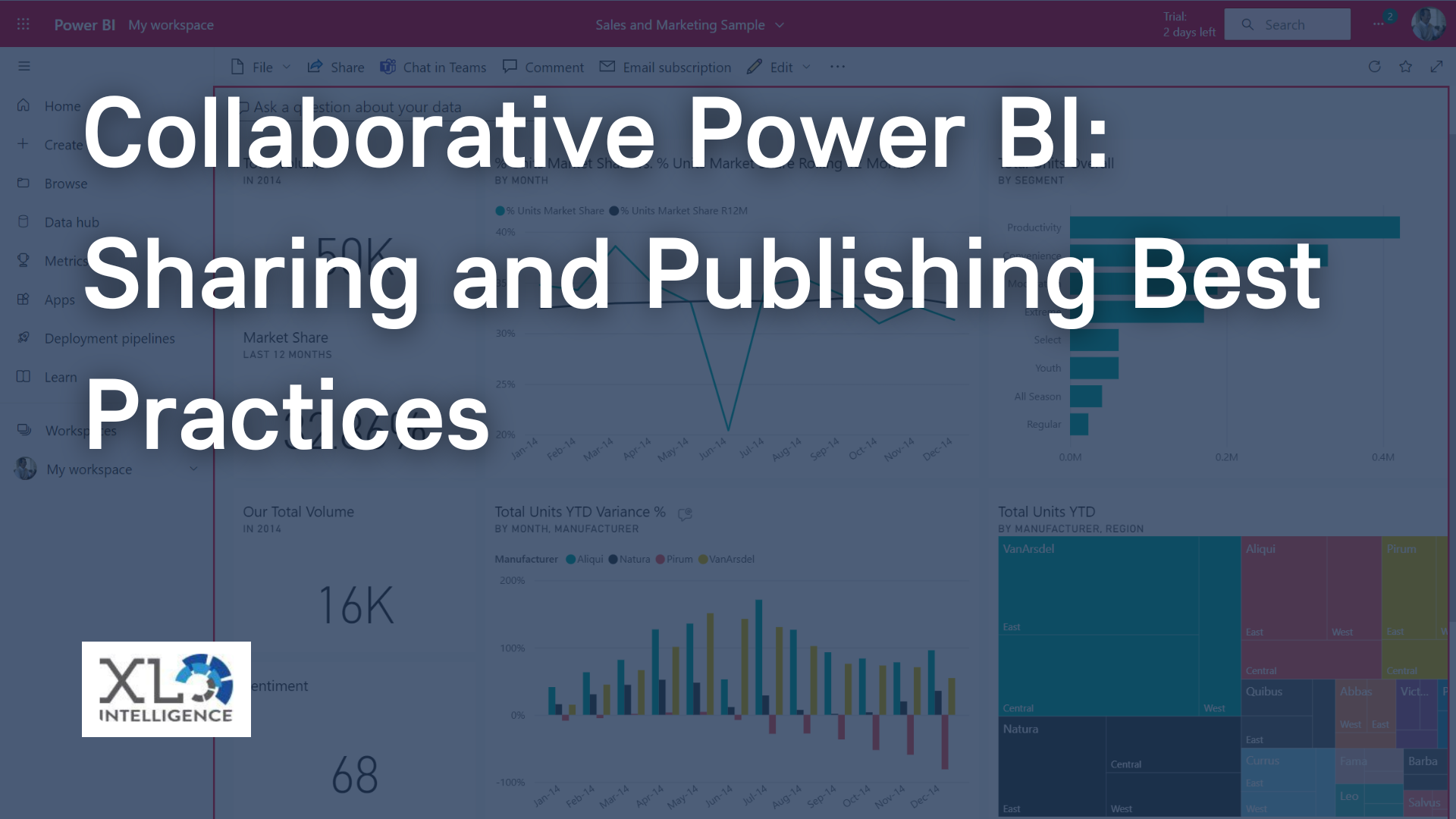
Power BI shines when it comes to collaboration within the Microsoft ecosystem. You can easily share your dashboards and reports with colleagues using Microsoft Teams or SharePoint. Imagine collaborating with team members, effortlessly discussing insights, and making data-driven decisions together. It's like having a virtual meeting room where data takes centre stage, fueling fruitful discussions and driving collective intelligence.
B. Tableau: Telling Stories with Data
Tableau takes collaboration to the next level with its storytelling capabilities. You can weave a narrative through your visualisations, guiding your audience on an immersive data journey. Imagine presenting your findings to stakeholders, captivating them with a compelling story backed by data. It's like being a master storyteller, leaving a lasting impact with your visual narratives.
Cost and Licensing Considerations
A. Power BI: Affordable and Flexible
Power BI offers various pricing models and licensing options, making it accessible to both individuals and organisations. With its free version, you can dip your toes into the world of data visualisation without spending a penny. As your needs grow, you can upgrade to paid editions with advanced features and enterprise-grade capabilities. It's like having a cost-effective data visualisation tool that scales with your ambitions.
B. Tableau: The Investment for Artistic Excellence
Tableau's pricing structures may lean towards the higher end, especially for enterprise-grade solutions. However, the investment pays off in terms of its robust features and artistic excellence. It's like owning a collection of high-quality art supplies that enable you to create masterpieces. So, if you're serious about data visualisation and willing to make an investment, Tableau will reward you with a canvas to unleash your creativity.
Pros and Cons Comparison
A. Power BI: The Marvellous Advantages
Power BI's strengths lie in its seamless integration with the Microsoft ecosystem, user-friendly interface, and affordability. It's like having a trusty sidekick that makes your data analysis journey smoother and more enjoyable. However, Power BI has limitations in terms of advanced analytics and complex calculations, which may limit its capabilities for data analysts with advanced requirements.
B. Tableau: The Artistic Advantages
Tableau's strengths lie in its flexibility, rich set of visualisations, and advanced analytics capabilities. It's like having a palette of colours and brushes that allow you to create stunning visualisations and dive deeper into your data. However, Tableau's learning curve can be steep for beginners, and its pricing may be a deterrent for some individuals or smaller organisations.
Conclusion:
In the ultimate data visualisation battle between Power BI and Tableau, there is no clear winner. Both platforms have their unique strengths and weaknesses, catering to different needs and preferences. Power BI excels in its integration with the Microsoft ecosystem, affordability, and user-friendly interface. Tableau, on the other hand, empowers data analysts with artistic flexibility, advanced analytics, and storytelling capabilities.
As a data analyst, you need to evaluate your requirements, consider your budget, and assess your comfort with each platform's interface. If you're already immersed in the Microsoft ecosystem and seek seamless integration, Power BI may be your superhero. If you're an artistic soul craving flexibility and advanced features, Tableau might be your artistic virtuoso.
Whichever tool you choose, remember that the journey of data visualisation is as important as the destination. Embrace the joy of exploring your datasets, unleashing your creativity, and empowering others with compelling insights. So, put on your analyst gloves, step into the ring, and let your data visualisation skills shine!
Now go forth, fellow data enthusiast, and unleash the power of data visualisation! May your visualisations be captivating, your insights be impactful, and your career soar to new heights. Happy analysing!
If you’re still not sure where to start with Power BI and your data visualisation journey, book a FREE Power BI training consultation today by visiting our
contact us page.
Get in Touch
We will get back to you as soon as possible.
Please try again later.
We specialise in Advanced Excel training, Dashboard development, Data Analysis, Power BI and VBA. We also provide training with, both standard and customised courses to suit your organisation’s needs.
Quick Links
Address
2, 26 Linden Gardens London W2 4ES
Phone
07737 707 548
by SEO Local Services | All Rights Reserved | XLIntelligence

